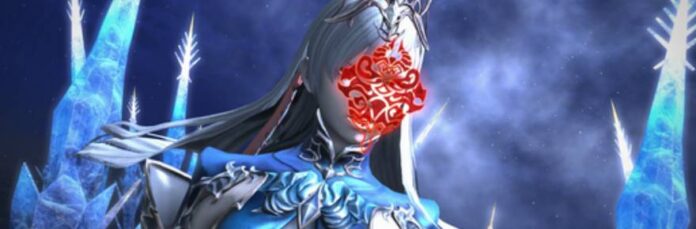
Dive into the enchanting worlds of LUNAR: Silver Star Story Complete and LUNAR 2: Eternal Blue Complete! Tag along on Alex and Hiro's quests and challenge enemies like the Magic Emperor and God of Destruction to save the world from dire peril in two adventures set 1000 years apart from each other! LUNAR Remastered Collection brings together LUNAR: Silver Star Story Complete and LUNAR 2: Eternal Blue Complete with enhanced graphics, audio, and quality-of-life improvements. Available for the first time on modern consoles, this remastered edition honors the beloved series that has remained in the heart of gamers since its initial release in 1992.
Hello! I've had the opportunity to work on a wide range of projects, from designing the assets for one of our title's national tournaments to collaborations with world-renowned IPs. The recent port of Grandia on consoles in 2024 was my first big project as the creative lead.
What was your initial reaction when you were asked to design the logo?
When I was presented with this project, I was excited and a little bit nervous about working on the Lunar logo, as it plays a key role in representing the game's brand identity. I began with a few different variations, and once I had a clearer idea of where I wanted to take the logo, it then became a cycle of receiving feedback and applying that feedback until we landed on the final design.
Regarding your design process and how this version ended up becoming the official logo, did you consider the original logos when designing the new one?
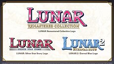
I always start off by conducting some preliminary research. Since we are releasing a remaster, I wanted the main logo design to reflect the brand image of Lunar that longtime players have held dear to their hearts. Using that as my foundation, I brainstormed and sketched out as many ideas as I could think of. I went through several variations of the logo, from slight tweaks to large changes. In the end, we decided to move forward with the above logo as the final design; the iconic red of Lunar with the inner shine, paired with new gold accents as a nod to the remastered qualities of the games.
The logo went through quite a few iterations before the final one was decided. Where did you draw inspiration from when designing each version?
My primary focus was on maintaining the nostalgic shape language and color of the original "Lunar" text, as well as incorporating the fact that it is a remaster. We made most of the sketch variations to test out various design directions to narrow down what we liked and didn't like. For example, variations two and three focused on color, mixing the red from Lunar: Silver Star Story with the blue from Lunar 2: Eternal Blue. Variations six through eleven and 17-18 focused on different accents, specifically the dragon sword and the ribbon from Lunar 2: Eternal Blue's Sega CD logo, along with visual elements from the games, such as a blue star. Finally, 12-16 tested out different shape languages for the font, from adding dragon accents to exaggerating the arcs and lengths of some letters. Eventually, a mix of one and five became what is now the official logo!

I personally love the extended tail in the "R" of "Remastered," which reflects the original Lunar logo's "R." For selected letters in "Remastered Collection," such as the R, E, and N, I exaggerated the serifs a little more to refine the shape language and make it more interesting.
Original Lunar artist, Toshiyuki Kubooka, contributed two new key visuals to remaster. What were your impressions and how did they inform your design process for the packaging?
I was dazzled by the detail that Mr. Kubooka put into the composition of the overall key visual for each game. It was a refreshing twist to previous Lunar art to see a darker background with a collaged composition. As for the front packaging, the layout was simple to complete, since the original key visual almost perfectly fit within the cover. There were only a few areas with slight placement changes, just to ensure everything was within the safety zone.


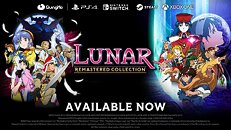
One of the first things I knew I wanted to do was add some of the pixel sprites onto the back cover because pixel graphics have a nostalgic charm and portray a lot of personality in each character despite the limited canvas size. To pair with the sprites, I added some screenshots to show a general overview of what the game content looks like. Design-wise, I made sure to tie in elements of the "Remastered" part of the logo, such as the gold coloring and the font, to keep everything on-brand. For the background, I wanted to make the sections distinct enough to showcase the two different games while maintaining the unified feeling of it being a collection, so I added a gradient transition. With all of the assets and composition in mind, this was the final layout I ended up on.

The opportunity to work with Mr. Kubooka under his art direction, along with the collaboration that designing the package fostered for each section. I worked on the design and visual aesthetic of the overall package but had a lot of support from GungHo's Marketing and Production teams, and from original developer Game Arts as well. Overall, this package design is a culmination of everyone's hard work that came together to make something that I hope you will all enjoy!
- Allyson Nicholas, Associate Community Manager, GungHo Online Entertainment America